The features of a perfect media player
We’ve had some fuzz about media players and the default choice for Xubuntu Karmic so I thought I’d give my two cents here. While this is not actually anything useful (at least yet), here is the media player UI of my dreams.
How does it look?
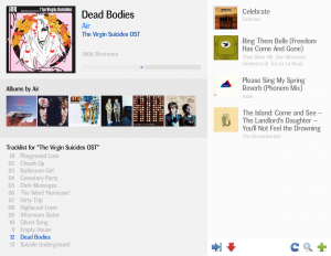
Here’s the main view. On the top left, there is the current track info (Track context), beneath it is the Artist context followed by the Album context. The Artist and Album contexts are updated once the player advances into next track (if they are not locked). You can also change their content by clicking different items, but more about that later.
On the right, you see the playlist. I’d like to think it more as sort of a “Coming/Next Up” -list, because playlists are very often changed on the fly. On the right bottom, there’s some controls so you can affect what music you are listening to.
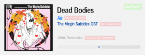
Track context: The most important element in a media player
I want to know which track is playing. I want to see the album art. I want to see it from ten meters. The track name needs to be big enough. Artist and album info is also important, so they are quite large as well. The year and genre tags aren’t that important to me, so I don’t want them to take too much space. It’s nice to have them there, anyway.
The biggest thing I’m not sure about showing the track length. I’m not even sure if I want to show a progress bar, like pictured. If the track suits your mood, you are most possibly going to listen it even if it was half an hour long (for example, some post-rock track). If you don’t want to listen a track, you’re going to skip it even if there was only ten seconds left of it. At least I will.
As you rip some parts of the track context away, you might even include more user-created context. I’d love to see personal notes on the track context. “Listen to the 3:45–4:02 part closely”, “Heard first time at trip to London” etc. Whatever you want.
Clicking the artist or album name would update the content in the according contexts. Clicking year or genre would add a filter to the playlist – ehm, filter the upcoming tracks.
Artist context: No surprises here… or?
Album art. You might also add user-created context here. I partly like the Wikipedia context browsers, but I’m not sure if I want to browse the web in my media player. My collection is an offline collection after all.
You might have a link to the artists website (user-defined?). I can see how this leads into people wanting to include MySpace links and such, but hey, once I have bought the CD, why would I want to visit the bands MySpace? Ok, you can follow their tour dates but… you usually can do that from the artists page aswell. No, I don’t want a list of upcoming gig dates in my media player (install Songbird).
By clicking the album art, you’ll update the album context. Surprise!
Album context: The biggest challenge
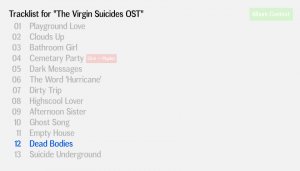
Okay, only a track list in the album context is a bit lame, I admit. This is definitely where most of the media players need innovation. You could do something really cool here. Like… album sleeve scans. That would be totally awesome. You could also list the musicians in the album and link them into database and search for other albums with a same musician and…
Ok, let’s just keep with the tracklist for a while. Clicking a track title naturally adds it to the queue of upcoming tracks.
Next up and the controls: Why so few buttons?
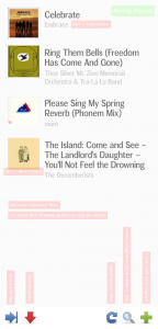
The list of upcoming tracks is not that innovative. The only notable thing is that I’d like to see the track names quite clearly. This is okay, as I don’t usually gather that much stuff in the so called playlist.
Tracks are added to the list randomly unless the user adds something manually. You can also add filters that filter the tracks which are added to the list. The filters are shown at the bottom (just above the controls) and you can remove them easily. I want to see the filters I’m using, so I’m not hiding them in a preference window.
The play controls (left bottom) look totally like me listening to music. Skip to skip tracks I don’t like. Or my wife does not like. Hold for pausing the music. Especially when the actual playing of music is controlled by MPD, you really don’t need other controls than these. Who uses the previous button anyway?
The list controls are as follows: Refresh (or scrap) the list. I didn’t want to listen these after all. (Or, my wife came home and she won’t let me listen to it.) Find for discovering your collection. You should get a nifty-looking collection browser here, but nothing too complex. A search from the ID3-tags? Maybe. And finally, add filters for adding some random filters, like “do not play Coldplay”, “play only the top twenty songs in each genre” etc. Whatever you want.
Clicking album art will update the album context, clicking an artist name will update the artist context. Simple?
Rating system
This is something that I’m always been interested in. I don’t really want to rate my music manually, because never would get that done and if I did, I would have changed my mind about half of the ratings. So the rating of tracks, albums and artists has to be automatic.
I was relatively satisfied with the rating system Amarok 1.x had, with a few exceptions. Really short (say, 10 seconds or less) tracks would never get a good rating – conversely, their rating would drop every time they were listened to. I’m not a big fan of that short tracks, but it broke the album ratings. If I am correct, the album rating was always calculated from the average of all the tracks’ rating. Not good, if you have twelve 4-11 second filler tracks at the beginning of an album followed by only four “real” tracks with overall length of nearly an hour.
I don’t think it was a design flaw, but the overall artist sorting didn’t really work. There was absolutely no emphasising on artists which had way more albums. If I had a one-album-wonder (prefrably even only a single or EP) band, high score for even a single track could pop the artist at the top of the list. I think that artists with only one item should have some artificial lift in the ratings as those are usually new and interesting bands about to maybe release their first long play and deserve a bit more attention.
It was usual that the bands nearing to show up in the favorite five listing got more “air time” as I wanted some change in the top. Once an album appeared there, I either wanted to keep it there for a long time and listened to it even more or wanted it to drop off the list and listened to something else just under the top five.
I’m not sure if I want the ratings to be constantly visible. I personally feel that they affect my music listening too much – if a track has a high score, I subconsciously think it must be good. Even if it wasn’t. It might just be something that slipped through.
The algorithm itself wouldn’t need to be that distinctive, but I’d like to see some moderating filters as described earlier. The big question is how to get these ratings affect the adding of new tracks in the upcoming. Straight limiting filters of course should be possible, but the system itself should be able to offer the listener (me!) a smooth experience with enough new and old tracks ranging from top tracks to the bottom ones – but only playing those so much one can tolerate.
“Do not try to add tracks with rating lower than x after user has skipped n tracks with rating lower than y.“, “Try to add a bit worse tracks, if the user has listened to n tracks with rating lower than x.“… Plus, take genres in the consideration: “If the user has listened to any track in genre x, but skipped/removed tracks below the rating y in genre z, play more of genre x, even the low score ones.” And finally, “Do not add tracks with the same name in the list all the time.”
Will it happen?
It is possible that I will implement a web-based interface for the MPD server. Will it have all I’ve described here, I don’t know. I’m not sure how realistic it is to carry out (or ask for!) this kind of features, so only time will tell.


